반응형
2021-01-01
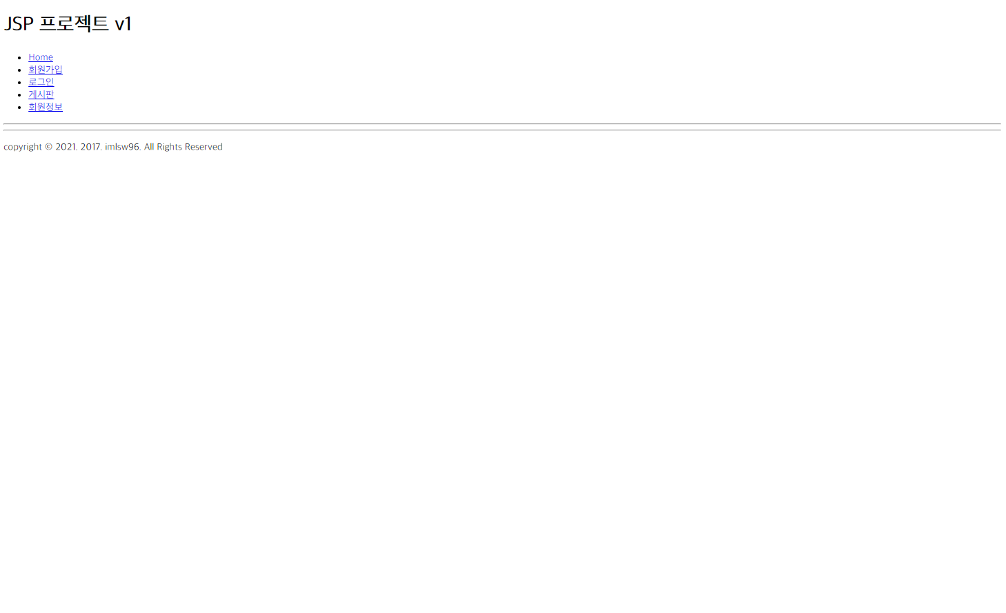
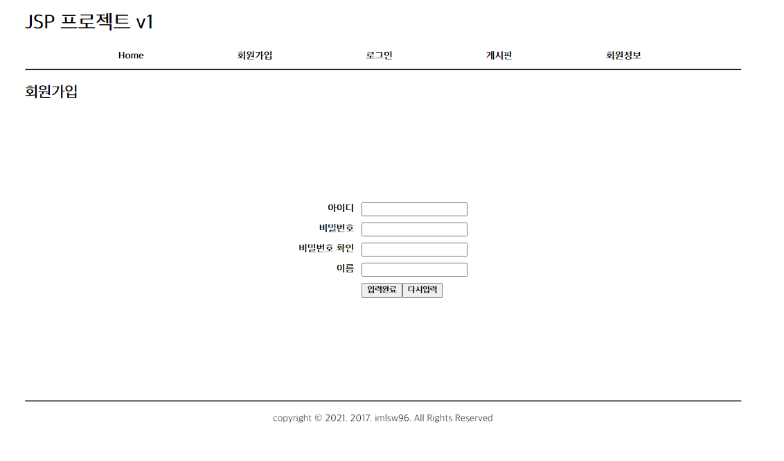
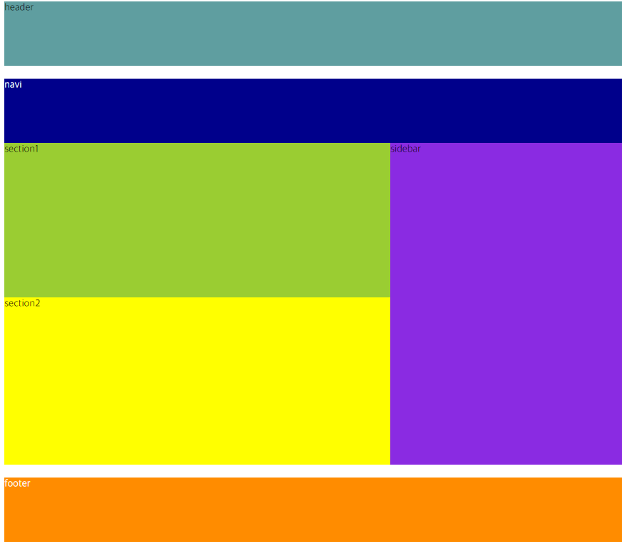
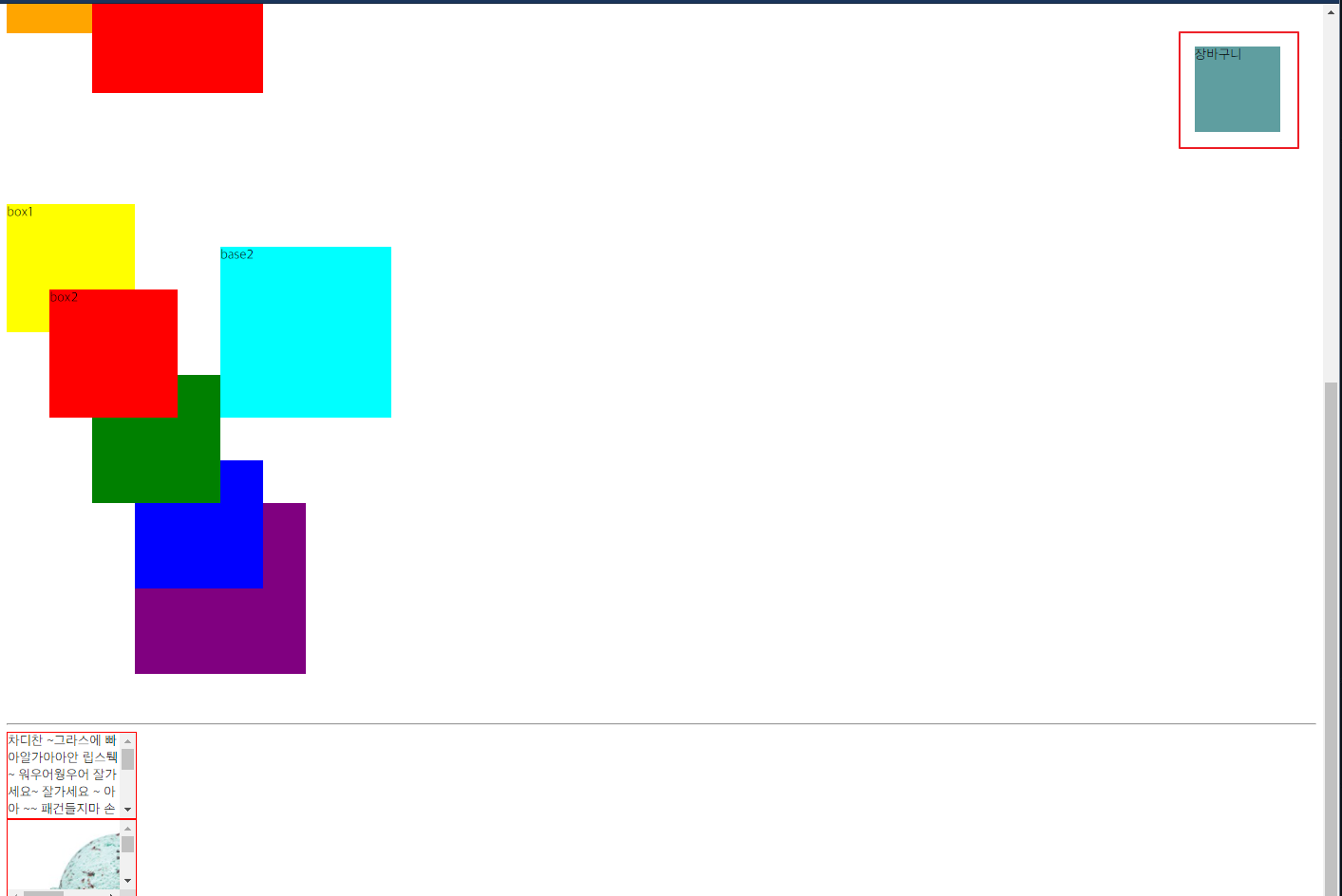
어제 선생님이 집에서 한번 짜보라고 이미지 파 일주 신 사진의 레이아웃을 잡아보았다.
전체적인 크기를 눈대중으로 잡다보니 내가 만든 건 생각보다 사진보다 전체적으로 길이가 길었다.
html 코드를 작성하고 거기다 css를 입히면서 계속 비슷하게 수정하다 보니 코드 전체가 복잡하고 지저분해 보이는데 이걸 체계적이라고 해야 되나 보기 좋게 코드를 작성하는 게 필요할 거 같은데 체계적으로 짜는? 그런 순서들이 있나 유튜브나 구글링을 통해 추가적으로 알아봐야겠다.
사진과 비슷하게 계속 수정하면서 든생각은 웹 레이아웃을 잡을때 코드를 어떤 식으로 작성해도 모양만 잡으면 되는 건지 그 부분이 혼란스러웠던 거 같다. 되게 무식하게 일단 그림과 비슷하게 맞추자는 생각으로 수업시간에 배웠던 내용들을 뒤죽박죽 섞어가며 어찌어찌 모양은 만들어내서 보고 있자니 뿌듯은 한데 한편으로는 과연 이렇게 짜도 되는 것인가 싶다 흠.. 위치가 잡기 어렵다면 html 태그를 span으로 바꾸기도 하고 막 진짜 이거 넣고 안되면 다른 거 넣고 막 일단 될 때까지 이것저것 집어넣고 만들어서.. 흠 ㅋㅋ 컹스하다 컹컹스

html 코드
<!DOCTYPE html>
<html lang="en">
<head>
<meta charset="UTF-8">
<title>layout2</title>
<link rel="stylesheet" href="2021-01-01.css";>
</head>
<body>
<header>
<div id="logo">로고</div>
<form id="search">
<input type="text">
<button>검색</button>
<ul id="tool">
<li>회원정보</li>
<li>로그인</li>
<li>회원가입</li>
</ul>
</form>
</header>
<nav>
<ul>
<li>프로젝트개요</li>
<li>공지사항</li>
<li>게시판</li>
<li>자료실</li>
<li>갤러리</li>
<li>커뮤니티</li>
<li>쇼핑몰</li>
<li>관리자</li>
</ul>
</nav>
<main>
<aside>
<ul id="menu">
<li>회원가입</li>
<li>아이디찾기</li>
<li>비밀번호찾기</li>
</ul>
<ul id="option">
<li>보안접속 ON |</li>
<li><input type="checkbox">자동로그인</input></li>
</ul>
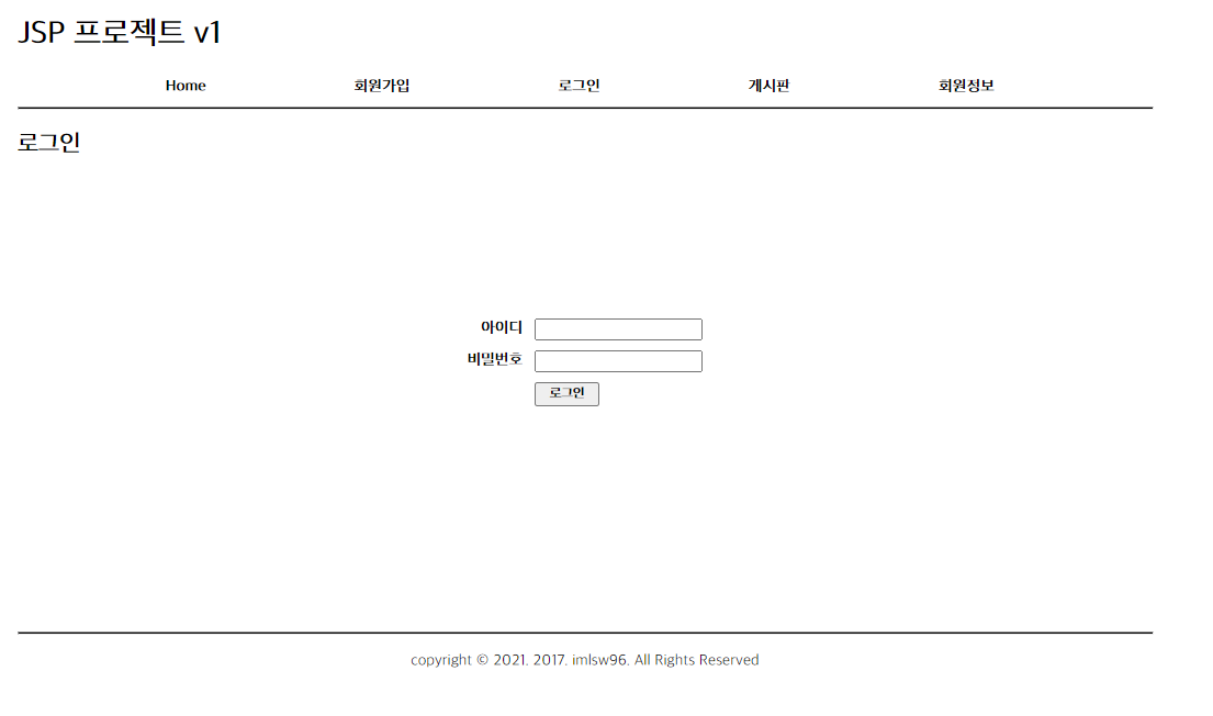
<table>
<form id="login">
<tr><td><input type="text"></td><td rowspan="2"><button>로그인</button></td></tr>
<tr><td><input type="password"></td></tr>
</form>
</table>
<p id="noti">공지사항</p>
<ul class="notice">
<li>아이유 사진도 좋아요</li>
<li>수지 사진도 좋아요!</li>
<li>아이유 사진도 좋아요</li>
<li>수지 사진도 좋아요</li>
<li>수지 사진도 좋아요</li>
</ul>
<div id="coment">광고문의 많이 주세요 ~~</div>
</aside>
<div class="container">
<div id="main1">
<h1>Hello, World!!</h1>
<p>Maecenas ac orci risus. Proin id justo in justo egestas aliquam eget ac ipsum. In sed massa non urna consectetur dignissim. Morbi felis mi, mattis id dolor sed, maximus porta turpis. Mauris massa magna, tristique sed dui quis, fringilla malesuada urna. Integer egestas lobortis velit, ut ultrices tortor laoreet non. Phasellus ut orci blandit, molestie felis non, consequat lorem. Nulla facilisi. Ut imperdiet arcu tincidunt sem efficitur vehicula. Sed aliquet odio vel velit auctor sodales. Nunc lacinia est eget pharetra viverra. Etiam nec justo non diam semper ullamcorper. Aliquam a volutpat tellus, vel dapibus leo. Praesent efficitur aliquet magna nec interdum. Etiam lacinia risus sollicitudin, dictum sapien at, convallis mi. Ut dignissim pellentesque metus ut elementum.</p>
</div>
<section2>
<div id="information">
<span>최신정보</span>
<ul>
<li>[SKT/번이]<갤럭시S3-할원:0원></li>
<li>[KT 번이/기변] 갤그랜드[0]</li>
<li>[SKT/번이]<갤럭시S3-할원:0원></li>
<li>[KT 번이/기변] 갤그랜드[0]</li>
<li>[SKT/번이]<갤럭시S3-할원:0원></li>
<li>[KT 번이/기변] 갤그랜드[0]</li>
<li>[SKT/번이]<갤럭시S3-할원:0원></li>
<li>[KT 번이/기변] 갤그랜드[0]</li>
<li>[SKT/번이]<갤럭시S3-할원:0원></li>
</ul>
</div>
<div id="rivew">
<span>사용기 /설치기</span>
<ul>
<li>엑스맨 감상기 [노스포]</li>
<li>[Her] 감상기 - 개인평점 9/10</li>
<li>아이패드 미니 1 간단한 사용기</li>
<li>엑스맨 감상기 [노스포]</li>
<li>[Her] 감상기 - 개인평점 9/10</li>
<li>아이패드 미니 1 간단한 사용기</li>
<li>엑스맨 감상기 [노스포]</li>
<li>[Her] 감상기 - 개인평점 9/10</li>
<li>아이패드 미니 1 간단한 사용기</li>
</ul>
</div>
</section2>
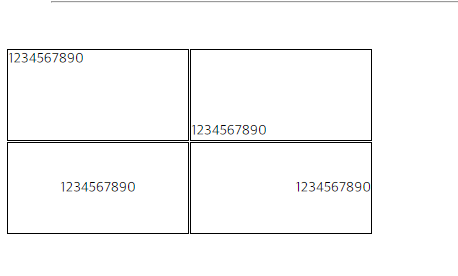
<div id="img">
<span>이미지 갤러리</span>
<ul id="img1">
<li><div></div></li>
<li><div></div></li>
<li><div></div></li>
<li><div></div></li>
<li><div></div></li>
</ul>
<ul id="title1">
<li>수지 환영</li>
<li>수지 환영</li>
<li>수지 환영</li>
<li>수지 환영</li>
<li>수지 환영</li>
</ul>
<ul id="img2">
<li><div></div></li>
<li><div></div></li>
<li><div></div></li>
<li><div></div></li>
<li><div></div></li>
</ul>
<ul id="title2">
<li>수지 환영</li>
<li>수지 환영</li>
<li>수지 환영</li>
<li>수지 환영</li>
<li>수지 환영</li>
</ul>
</div>
</div>
</main>
<footer>
<span id="ft1">이용약관
개인정보보호방침
이메일무단수집거부
고객지원
권리침해신고 광고문의</span>
<div id="lg">
</div>
<span id="ft2"> Copyright(c) 2021. imlsw96 All Rights Reserved. Designed by HTML5, CSS<br>
1 Infinite Loop, Cupertino, CA 95014. 개인정보 관리 책임자 : 스티브잡스 steve@apple.com</span>
</footer>
</body>
</html>/*헤더*/
body {padding:0; margin:0;}
body {width:1250px; margin:50px auto;}
#logo {width:300px; height: 150px; background: silver; display: inline-block;}
#search {display: inline-block; width:950px; height:150px; background: yellowgreen; float:right;}
#search input {margin: 50px 0px 50px 55px; padding: 15px 200px; border: 5px solid darkgreen; }
#search button {padding:14px 30px; border: 5px solid darkgreen; font-weight: bold; color:white; background: darkgreen;
border-right:5px solid black; border-bottom: 5px solid black; font-size:14px;}
#tool {float:right; list-style-type: none; padding-bottom: 10px; }
#tool li {float:left; padding-right:10px; font-weight: bold;}
nav {clear:both; background:black; height: 30px; padding-top:5px; }
nav ul {list-style-type: none; width:1250px; margin:0 auto;}
nav li {color:white; float:left; padding-right:70px; font-size:20px; padding-left:20px;}
/*메인*/
/*사이드바*/
main {min-height:1000px;}
aside {float :left; width:300px; background: yellow}
#menu {list-style-type: none; margin-top: 50px;}
#menu li{float:left; padding-right:10px; padding-bottom:5px; font-size:14px;}
#option {clear:both; list-style-type:none; border-bottom: 3px solid gray; }
#option li {float:left; padding-top:5px; font-size:18px;}
table {margin:0 auto;}
table input {width:100px; padding:5px;}
table input[type='text'] {margin-bottom:7px;}
table button {margin-right:20px; padding:22px;}
#noti {clear-side:auto; background:black; color:white; font-size:18px; font-weight: bold; margin-top: 450px;}
.notice { list-style-type: none;}
.notice li {font-weight: bold; padding-bottom: 6px;}
#coment {font-weight: bold;}
/*Hello World*/
.container {float:right; width:940px; background: darkorange;}
#main1 {width:900px; height: 550px; background: mediumturquoise; margin:30px 20px 30px 20px; }
#main1 h1 {font-size: 75px;display: inline-block; margin-left: 25px; margin-top: 10px;}
#main1 p {font-size: 20px; font-weight: bold; width:600px; margin:0 0 50px 50px;
padding-bottom:5px; }
/*최신정보 사용기/ 설치기*/
section2 {width: 900px; clear: both;}
#information{width: 420px; margin-left: 20px; float:left; background: white;}
#information ul{list-style-type: none; }
#information span {text-align: left; background: mediumpurple; padding:10px 0 0px 0; width: 420px;
display: inline-block; font-size:23px; font-weight: bold;}
#information li {padding-bottom:5px; font-size:18px; padding-bottom:10px;
margin-right: 20px;}
#rivew {width:420px; float: right; background: white; margin-right:20px;}
#rivew span{text-align: left; background: greenyellow; padding:10px 0 0px 0; width: 420px;
display: inline-block; font-size:23px; font-weight: bold;}
#rivew ul {list-style-type: none;}
#rivew li {padding-bottom:5px; font-size:18px; padding-bottom:10px;
margin-right: 20px;}
/* 이미지갤러리 */
#img {clear: both; width: 900px; height:450px;background: burlywood; margin-left:20px; margin-top:480px; margin-bottom: 50px;}
#img span {background:purple; display: inline-block; width: 900px; color: white; font-size: 23px;
padding:10px 0 0 0;}
#img1 {list-style-type: none; list-style-position: inside;}
#img1 div { width: 135px; height: 135px; border: 1px dashed black;background: white; float: left; margin:10px 20px 10px 7px; display: inline-block;}
#title1 {clear:both; list-style-type: none; list-style-position: inside;}
#title1 li {float: left; width: 160px; font-size: 22px; border: 1px solid burlywood; text-align: center; }
#img2 {clear:both; list-style-position: inside; list-style-type:none;}
#img2 div { width: 135px; height: 135px; border: 1px dashed black;background: white; float: left; margin:10px 20px 10px 7px; display: inline-block;}
#title2 {clear:both; list-style-type: none; list-style-position: inside;}
#title2 li {float: left; width: 160px; font-size: 22px; border: 1px solid burlywood; text-align: center; }
/*footer*/
footer {clear: both; width: 1250px; height: 200px; background: green}
#ft1 {background: blue; display: inline-block; width: 1250px; text-align: center; color: white; font-size: 22px;}
#lg {display: inline-block; width: 300px; height: 170px; background: purple;}
#ft2 {display: inline-block; margin:-60px 10px 0px 550px; padding-left: 50px;
font-weight: bold; float:right;}

반응형
'JAVA & APP :국비지원 학원 복습 > CSS' 카테고리의 다른 글
| CSS : 웹레이아웃 짜기 (0) | 2021.01.01 |
|---|---|
| 실습예제) CSS로 웹레이아웃 잡기 (0) | 2020.12.30 |
| CSS: 11 Table (0) | 2020.12.30 |
| CSS : 10 list (0) | 2020.12.30 |
| CSS : 09 Float (0) | 2020.12.30 |